Overview Of Trendline Forex Trading Strategy:
Trendline Forex Trading Strategy Recommendations:
- Time-frames: Any.
Currency Pair: Any.
Indicators: Nil.
General Setup For Long Entry:
General Long Entry Trade Setup Checkup List:
- Points (1) and (2) are used to draw a trendline.
Wait for points (3) and (4) etc… to happen for entry.
Points (a) and (b) are used to take profit and exit.
This figure below represents the general setup for Long Entry (or Buy Setup).
Click on the image to open the full size version!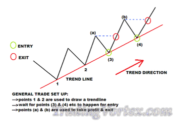
Trendline Forex Trading Strategy Long Entry Example:
You could have taken these trades shown below with almost pin-point deadly accuracy with the Trendline Strategy.
Click on the image to open the full size version! 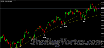
General Setup For Short Entry:
General Short Entry Trade Setup Checkup List:
- Points (1) and (2) are used to draw a trendline.
Wait for points (3) and (4) etc… to happen for entry.
Points (a) and (b) are used to take profit and exit.
This figure below represents the general setup for Short Entry (or Sell Setup).
Click on the image to open the full size version!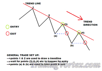
Trendline Forex Trading Strategy Short Entry Example:
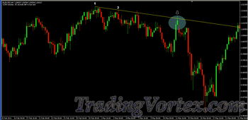
Notice how many times price reacted and obeyed this trendline below. Would you have made money if you had gone short? Yes of course.
Click on the image to open the full size version!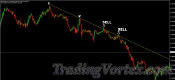
Trendline Forex Trading Strategy Real Examples:
Before introducing you to the rules of the Trendline Forex Trading Strategy, let me show you some concrete examples demonstrating the strength of this strategy.
- On the chart below: only 3 trades and 800 pips of floating profit, majority of profits locked and I am not out yet, and all this is in just one week. This pair was still heading down when I got its screenshot. When I closed all the 3 trades, it was more than 800 pips in total profit.
Click on the image to open the full size version!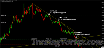
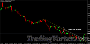
- On the chart below: Pinpoint Deadly Accuracy on USDCHF chart. The trendline entry was taken in the 5 min time-frame.
Click on the image to open the full size version!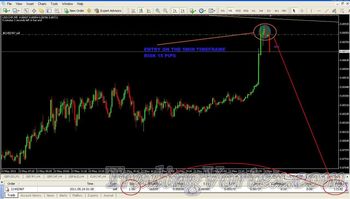
- On the chart below, This is how it was turning out almost 7 hours later:
- How to draw Valid Trendlines?
When is a trendline still valid and when does it becomes invalid?
Understanding some Common Mistakes in drawing trendlines.
How to know which trendlines are most likely to hold and which ones will not?
support And Resistance and how to use them to your advantage?
Understanding trends and know when they may be starting or ending.
Technical analysis: the best way to analyze your charts without too many indicators (matter of fact, you don’t need any indicator at all but just price).
Having a good understanding of the points listed above is very essential for the successful application of the Trendline Forex Trading Strategy.
How To Draw Valid Trendlines?
How Do You Draw Trendlines?
Easy, in 2 simple steps. Here they are:
- STEP#1: Identify Obvious Peaks and Troughs.
Click on the image to open the full size version!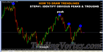
- STEP#2(A): Connect a minimum of 2 Peaks (or highs) with a line from left to right and you have a downward trendline.
Click on the image to open the full size version!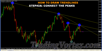
- STEP#2(B): Connect a minimum of 2 troughs (or lows) with a line and you have an upward trendline.
Click on the image to open the full size version!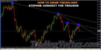
That is how simple it is to draw trendlines.
Difference Between The Outer Trendline And The Inner Trendline.
This is an important key point you need to know because when you draw trendlines, they would usually fall into the Outer Trendline and the Inner Trendline.
- outer Trendlines are the usually the main trendlines drawn from much significant peaks or troughs and they are quite obvious in the larger time-frames like 1 hr and 4 hr and upwards.
inner Trendlines are trendlines drawn within or inside the outer trendlines and generally, when you switch to smaller time-frames, you tend to get a lot of inner trendlines.
Click on the image to open the full size version!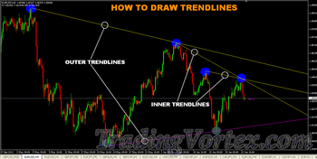
The peaks and troughs that are used to draw inner Trendlines are sometimes quite difficult to spot if you are in a larger time-frame. like the 4 hr or the daily but when you switch to the 1 hr or the 30 min and 15 min, the peaks and troughs become obvious to draw these inner trendlines.
Which Lows Or Highs To Use To Draw A Trendline?
Now, for most beginners, the confusion begins when they look at a chart and see too many lows and highs and they just cannot figure out which two they are going to use to draw a trendline.
The solution to this problem comes down to prioritizing which lows or highs to use and the general rule is this:
- For Lows, the one with more Higher Candlesticks on its left and right will be more significant than the one with lesser candlesticks on its left and right.
- And it works the same for Highs except that it is completely opposite: you should be looking for more Lower Candlesticks.
The chart below makes this concept a lot clearer:
Click on the image to open the full size version!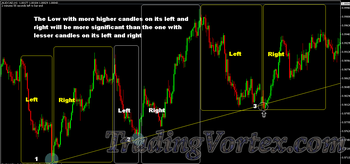
In other words, you look for highs and lows that are easy to spot. Let me explain further:
- When you select the 2 highs (for drawing downward trendline) or the 2 lows (for drawing upward trendline) they must be visible or obvious to everyone else. There should be no ambiguity. Everyone else must be able to see or spot them clearly.
- And if the lows or highs can be clearly seen and identified, that means that they are significant because that is where the market has been observed to reverse significantly.
Identify Significant Lows To Draw An Upward Trendline:
On the chart below, how many “Visible Or Obvious” AND, therefore Significant lows can you find?
Click on the image to open the full size version!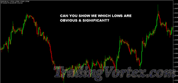
I can see 4. Can you? Here they are!
Click on the image to open the full size version!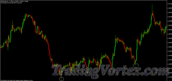
And this is what you get when you draw an upward trendline connecting the first two lows. And on the 3rd and the 4th lows when price came back down to test the trendline, you could have entered long with very LOW risk and made good amount of profit in each trade.
Click on the image to open the full size version!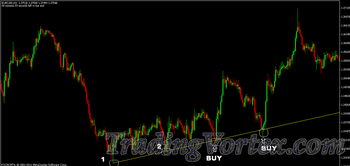
Here is another example: Notice on the chart below, the Lows are obvious and therefore easy to spot (significant) and the result is you get a nice upward bounce when price came down tested the trendline that was drawn.
Identify Significant Highs To Draw An Downward Trendline:
ANSWER: If you are a beginner, to avoid the confusion, stick to only drawing trendlines based on significant highs (peaks) or lows(troughs). As you gain more experience and confidence, you can start trading off trendlines drawn on insignificant lows or highs or combination of insignificant and significant lows or highs.
It does take a bit of practice and skill to be able to draw inner trendlines when it comes to picking which two points to use. The more you practice, the more you will be able to do this easily.
The chart below shows an example of this situation:
Click on the image to open the full size version!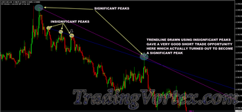
These trendlines drawn from insignificant peaks or troughs are simply inner trendlines.
Differentiate Between Valid And Invalid Trendlines:
- A trendline is valid as long as it is not intersected significantly and price continues to obey it.
A trendline becomes invalid when it is intersected significantly and this could mean that the trend has now probably changed.
How Can You Tell If A Trendline Is Intersected Significantly?
The exact formula to determine this does not exist, but here are 3 things that could be used to determine if the intersection could mean a breakout of the trendline or not:
The candlestick that intersected the trendline, has it CLOSED above or below it?
- If a candlestick closes above a downward trendline by a significant distance then that may be a signal that the downward trendline is now violated.
- The opposite is also true for an upward trendline: if the candlestick closes below it significantly, that may be a signal that the upward trendline is now violated and the price would now be heading downward.
- If a candlestick just intersects but fails to close above/below a downward/upward trendline, then expect the trendline to be obeyed.
The length of the body of the candlestick (if it is long or short) that closed above the downward trendline and below the upward trendline:
The longer the length of the body of the candlestick that closes above/below a downward/upward trendline, the greater the possibility that the trendline has now been violated.
You would need additional confirmation and the best way is the use of reversal candlesticks. More on that later.
The CLOSE of the 1 hour or the 4 hour candlesticks:
- The close of 1 hr and 4 hr time-frame candlesticks are very important in determining if the trendline is likely to be broken on not.
If you see a 1 hr candlestick closed below an upward trendline, there is a great chance that that trendline is now intersected and price will continue to move down.
The opposite is also true for downward trendline.
Generally, the 1 hr close above or below a trendline has more significance than any other time-frame closes.
That is why on many occasions, you see a trendline intersected significantly in a much smaller time-frame like the 5 min, 15min or 30 min and you may think that the trendline is intersected but then the 1 hr candlestick eventually closes above it (or below it for downward trendline) and then you see price continue to obey the trendline.
Examples showing the importance of the 1 hour and 4 hour candlestick closes:
For example this is the 5 min chart showing the upward trendline being intersected and couple of candlesticks closing below the trendline:
Click on the image to open the full size version!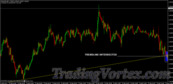
The next chart is the 1 hour chart of the same pair above showing the 1 hour candlestick (red) which intersected But closed above the upward trendline:
Click on the image to open the full size version!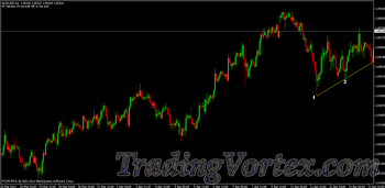
And this is the chart showing what happened next as the result of the 1 hour candlestick close:
Click on the image to open the full size version!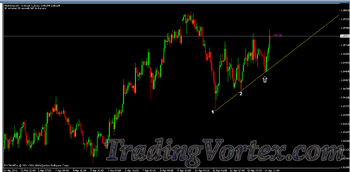
Do you understand what I’m showing you here?
Remember: 1 hour & 4 hour candlestick closes are very important!
One more example of using the 1 hour and 4 hour closes: In the 1 hour chart below, notice that the downward trendline is intersected significantly. Remember what I mentioned above about length of the body of the candlesticks? Looks like trendline is intersected significantly because the 1 hr candlestick closed significantly above the downward trendline. What do you think?
Click on the image to open the full size version!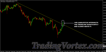
About 3 hours later in the 4 hr chart, this is what happened:
Click on the image to open the full size version!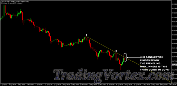
Now, what do you think is most likely to happen? And this is how it turned out:
Start paying attention to the closes now especially when they happen around trendline entry points.
You need to also pay careful attention to the lengths of the bodies of candlesticks around trendline entry points because they will give you an indication of the sentiment of the market.
Examples showing the importance of the body length of the candlestick that intersected the trendline:
On the chart below. there are 2 downward trendlines. In each instance, observe that the candlesticks that intersected the trendlines to the upside were very bullish candlesticks with very long body and they closed significantly above the trendlines resulting in the trendlines becoming invalid.
Click on the image to open the full size version!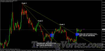
Notice in the chart below that the candlestick that intersected and closed above the trendline lacked upward momentum (very short body failing to close even more than 50% above the trendline) and what happened is the price is made to obey the trendline once again as the market took a nose-dive.
Click on the image to open the full size version!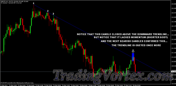
One more example: The chart below shows 2 very bullish candlesticks with very long bodies indicating a very strong upward momentum. Then the third candlestick is formed, by contrast, it has a very shorter body than the first two. So we know the market is losing its steam.
- Do you notice something?
- And what happened after that?
- The chart shown below gives you a picture of how this one turned out.
No, long candlesticks too can be included. All that will be revealed. Keep reading!
4 Common Mistakes In Drawing Trendlines:
The successful application of the trendline trading strategy depends a lot on you drawing quality and valid trendlines. You just cannot afford to mess up with this. You’ve got to be precise, spot on.
Here are some common mistakes I have observed from many traders asking me if they where drawing the right trendlines or not.
Mistake#1: Drawing Trendline Through An Obstruction:
There should not be any price obstruction between point 1 and 2. This is highlighted by the blue area with an “x”:
Click on the image to open the full size version!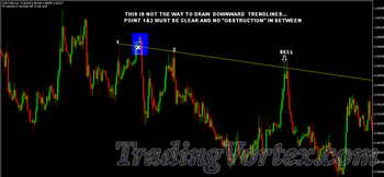
Similarly for drawing upward Trendlines. Between point 1 and 2, there must be no price obstruction:
Click on the image to open the full size version!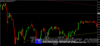
Mistake#2: Drawing Through Wick And Body Of Candlesticks:
Some beginners draw a line through the general direction of the trend. They break all the rules here. If the trendline is drawn and crosses a lot of wicks and body of candlesticks, it does not give you any information regarding where the support or resistance level is located. This is a wrong way to draw a trendline.
Click on the image to open the full size version!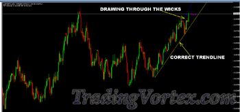
Mistake#3: Not Drawing A New Trendline And Keeping A Breached Trendline:
This is the case where there is a FALSE break or breach of a trendline and then market continues in the original trend direction it was heading previously.
If the price breaks the trendline significantly, that trendline is no longer valid. If the market continues in the same direction then a new trendline can be drawn as shown in the chart below based on the new high (or low) that is formed.
Click on the image to open the full size version!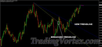
Answer: The best practice is to draw a new trendline. However, even in saying that:
- I usually keep the breached trendline: because price is still obeying it and I would ALSO draw the new trendline using the new high or low point that was made.
My reason for keeping the breached trendline is based ONLY on: HOW FAR the price has moved in relation to the trendline that was breached.
If significant like the above chart, I will not keep that trendline.
I will show you why. See the chart below?
Click on the image to open the full size version!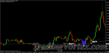
As you can see: Price breached and made a low under the red trendline and then came back up and started to obey this trendline again and some time later, an opportunity to Buy for a 2nd time was presented which could have resulted in a highly successful trade.
If I had removed the first trendline (red) simply because it was temporarily breached, I would have missed out on taking a nice trade setup.
That’s why I would still keep breached trendline depending on how far away the price has moved and also pay close attention to candlestick patterns around this kind of setup as well.
Answer: Quite Difficult to give an exact answer on this because the “how many pips” also depends on the time-frames. So for example:
in a 5 min time-frame., keeping a breached trendline which is 5-10 pips away is still ok but wont be ok if its like 30 pips.
In 1 hr time-frame., 20-40 pips is reasonable.
In 4 hr time-frame., keeping a breached trendline 40-60 pips will still be ok because it is a larger time-frame.
Mistake#4: Drawing Trendlines That Are Not Touching The Peaks Or Troughs:
This is one major mistake that I have observed a lot. What happens is that traders fail to actually connect the 2 peaks or troughs that are required to draw a trendline. The trendline MUST touch these two points that you use to draw the trendline.
Click on the image to open the full size version!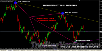
If you fail to do this properly, you will have situations like shown on the chart below where the trendline is not touched and price moves away from it, AND, if you were waiting for a touch of trendline so that you can enter, Guess what? You will NEVER get it!
Click on the image to open the full size version!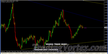
Strong And Weak Trendlines:
The more times price comes, touches and then is made to obey a trendline determines the strength of the trendline.
If price is made to obey a trendline more than once, consider that as a strong trendline.
Additionally, there is something else which I also use to give me an indication of how strong a trendline will be: the steepness of the trendline. You may also call it the slope of the trendline. You will notice on charts that:
- The most reliable or strong trendlines are gently sloping trendlines.
- The steeply sloping trendlines are generally, very unreliable.
Answer: Because the market cannot be sustained at this steepness for a very long. For very steep trendlines, price usually obeys the trendlines only once or sometimes none at all.
In the chart below, notice that price climbed up at a very steep angle, and even couldn’t obey or find support on the very steep trendline that was drawn, it just busted its way right down. Later price found a much lower level of steepness which was sustainable, and then it continued to move up again.
Click on the image to open the full size version!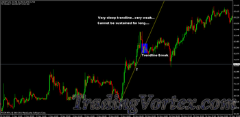
The chart below shows an example of steep trendlines that was unreliable:
Click on the image to open the full size version!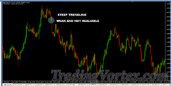
Price tends to react predictably on gentle sloping trendlines by obeying it than on steep trendlines.
The chart below shows what I mean. Also notice how the market reacted and how many times it obeyed this downward trendline:
Click on the image to open the full size version!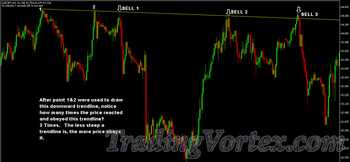
Here is another example where the market has obeyed the uptrend line multiple times:
Click on the image to open the full size version!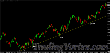
Gently sloping trendlines are very strong trendlines so always keep an eye for multiple trendline trading setups.
This information is very important because:
If you are in a trade based on a steep trendline entry on the first buy or sell setup, you should look to take your profit quickly, lock in your profits quickly or move to break even quickly because, you know that the steepness cannot be sustained for a very long period of time.
Don’t rush to get in on a trade based on a steep trendline especially if it is on the 2nd or 3rd buy or sell setup as there is a greater probability that the market would have lost its steam by then and may start to reverse very quickly.
Support And Resistance:
When we draw trendlines, we are operating on two very important concepts: Support and Resistance.
In a bearish trending market, the downward trend line provides the resistance: price go up and reverses back down from the trendline.
Click on the image to open the full size version!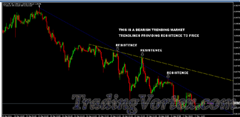
In a bullish trending market, the upward trendline provides support for prices: prices go down touch the trendline and bounce back up from the support provided by the upward trendline.
Click on the image to open the full size version!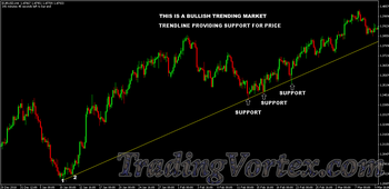
Trendline are as good as long as price keeps obeying it. When price breaks or intersects a trendline that may signify a trend change.
Trendlines provide support and resistance diagonally and should not be confused with horizontal support and resistance levels. But you can actually combine these two for trade entry setups.
Combining Trendline With Horizontal Support And Resistance Strategy:
I will show you a technique here where you can actually combine trendline support and resistance with horizontal support and resistance for trade setups & entries.
This is one of the most powerful techniques to get into high probability trades and it is to your greatest advantage to be able to spot this setup when this happens and take trades based on that.
On the chart below: A trendline entry setup happens which also coincides with a previous resistance level intersected now turned support. Now you have two supports working for you at the same time at the same level:
- The trendline providing support and
The previous resistance level turned support also providing support.
So what is the most likely direction price is going to go? Up!
Click on the image to open the full size version!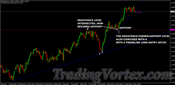
How does a short trade setup look? Just the exact opposite! The previous support level broken becomes resistance level and the level where this happens coincides with a downward trendline entry point. A chart of this situation is show below.
Click on the image to open the full size version!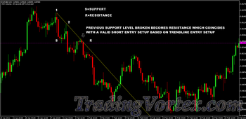
Now, the two charts below show another way in which you can use trendlines and horizontal support and resistance levels. This chart below shows a trendline short trade setup that coincides perfectly with horizontal resistance levels.
Click on the image to open the full size version!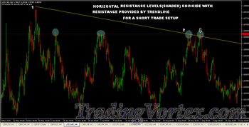
The chart below shows the exact but opposite setup for the above chart but this time, it is the long setup based on support levels coinciding with upward trendline entry.
Click on the image to open the full size version!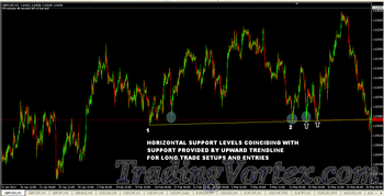
So now you know that it is a good practice to check to see the level where you are entering a trade has a:
- Horizontal support level or
Horizontal resistance level or
Support level-broken-turned resistance level or - Resistance level-broken-turned support level working in your favor or not.
As a trader, when you are trying to enter into a trade based on a trendline setup, keep this in the back of your mind. You’ve got to be aware of these kinds of things and don’t take it lightly.
The Trend Is Your Friend:
Follow the trend and get paid big time.
Support levels, upward trendlines, news. These are the things that can change the direction of the market.
In some cases you can but only for a short while because you are going against the current and sooner or later you will tire out and quit. Same thing in forex trading.
Plain simple concept but many totally ignore this and pay a high price for that.
The first thing when you open a chart within less then 5 seconds you should know what the present trend is and you should also know if a trend might be ending and a new one starting. “This section is about that”.
Trend is simply the overall direction in which price is moving: UP, DOWN or SIDEWAYS. There are 3 types of trends. An UPTREND, a DOWNTREND and a SIDEWAYS TREND.
- An Uptrend is where there is a consistent move higher where the market is making successive Higher Highs (HH) and also Higher Lows (LH).
- A Downtrend is where there is a consistent move lower where the market is making successive Lower Highs (LH) and Lower Lows (LL).
- In a Sideways trending market, prices will be contained within a price range until it breaks out. Consider this as a resting period. After resting, it usually continues in the direction of the overall trend.
The chart below is an example of a market in an uptrend. Notice the “increasing peaks” or Higher Highs and the “increasing troughs” or Higher Lows.
Click on the image to open the full size version!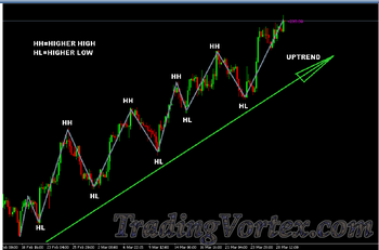
The chart below is an example of a market that is in a downtrend. Notice the “decreasing peaks” or Lower Highs and the “decreasing troughs” or Lower Lows.
Click on the image to open the full size version!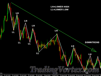
The chart below is an example of a Sideways or flat trending market:
Click on the image to open the full size version!
Answer:
Uptrend changes to downtrend when the pattern of successive Higher Highs and Higher Lows is broken with a formation of a new Low that is lower than the previous low. This is the beginning signal of a possible trend change.
Downtrend changes to an Uptrend when the pattern of successive Lower Highs and Lower Lows is broken with a formation of a new high, that is higher than the previous high. This is a signal that the trend may be changing to an uptrend.
The chart below clearly illustrates the points made above and shows how an uptrend changes to a downtrend and vice versa:
- When a HL is broken, it gives the signal of a possible downtrend
When a LH is broken, it gives the signal of a possible upward move
Click on the image to open the full size version!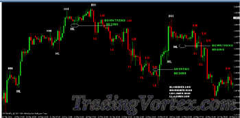
You must fully understand this concept because I believe it gives you the ability to just glance at your chart and know if you are in an uptrend or downtrend situation and also it gives you the ability to spot if a new trend has just started.
You don’t need to be a rocket scientist to figure it out. There are 2 reasons for this:
Reason#1: I want to be able to get in a trade at the very beginning of a trend when the signal is given that a trend change may be happening.
Reason#2: If I have been locking my profits and trailing stop my trade under higher lows or lower highs, it signals my time to get out or even better, the market actually takes me out!
And the very good example for Reason#1 is displayed in the chart below:
First, a HL is intersected giving a possible downtrend signal. Second, price goes up to touch the downward trendline. Knowing already that a downward trend signal has been already given and now that a trendline setup is happening, you should be confident to enter a short order.
Answer: The market falls!
Am I correct to say that if a trader entered a short trade as shown, would he have entered a trade at almost the BEGINING of downtrend? Definitely!
Click on the image to open the full size version!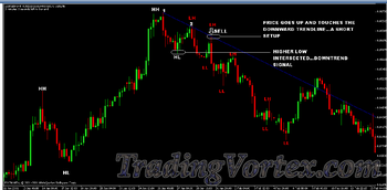
This example above shows how the information on “how trends change” when combined with trendline trading strategy allows a trader to get in at almost the beginning of a new trend!
Always keep this at the back of your mind when you are analyzing charts and waiting for setups.
In the chart below, notice that the Higher Low, HL, was intersected and price plummeted. Later, a Lower Higher, LH is intersected, signifying an uptrend signal. So this looks like a beginning of an uptrend happening right here.
Click on the image to open the full size version!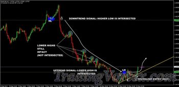
So now you can see the importance of understanding trend changes and if you can be able to spot them and use this information in conjunction with trendline entries, it essentially allows you to jump in a trade at almost the beginning of a new trend.
Short, Medium And Long Term Trends And Trendlines:
We can further break down trends into 3 types:
- The short term trends: Short term trends are found in time-frames anywhere from 1min up to 30mins.
- The medium term trends: Medium term trends can be found in 1 hr up to 4 hr time-frames.
- The Long term trends: Long term trends can be found on 4 hr, daily up to the monthly.
Based on the above, we can further classify trendlines into 3 types of trendlines:
- Short term trendlines (1min up to 30mins).
Medium term trendlines (1 hr up to 4 hrs).
Long Term Trendlines (4 hr up to Monthly).
Long Term Trendlines have more significance over Medium Term Trendlines which have more significance over the Short Term Trendlines.
What this means is very simple, for example, a short term trend is down but the medium term trend is up, so as this short term downward trend approaches the level or zone of influence of the medium term trend provided by the upward trendline 2 things usually happen:
- The short term trend continues to move down in violation or total disregard to the medium term trend and trendline which should have acted as support: meaning the medium term trendline is intersected and now becomes invalid. In this case, this may be the start of a new downward medium term trend.
The short term trend bounces up from the medium term trendline and obeys it.
Answer: The big ugly, never-aging old Moe is going to win...most of the time anyway...when “Big Daddy” Homer Simpson is Not around...
A similar situation happens in the markets. You go long in a 15min trendline entry and the market is going up nicely and soon you come to an opposing medium term downward trendline. The medium term Trendline has more significance than the short term trendline, therefore, the market has a very high probability of obeying the medium term trendline, even though right now the market is going up on the 15min time-frame. Here is an example of that situation:
Click on the image to open the full size version!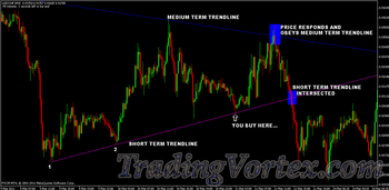
Now you know what can happen if you ever come across this situation. Mind you, they happen frequently.
WRITING IN PROGRESS...




 TradingVortex.com® 2019 © All Rights Reserved.